Shaping safe circuit-breaker control for power system operators

Harness Ultra @ ABB Electrification Smart Power
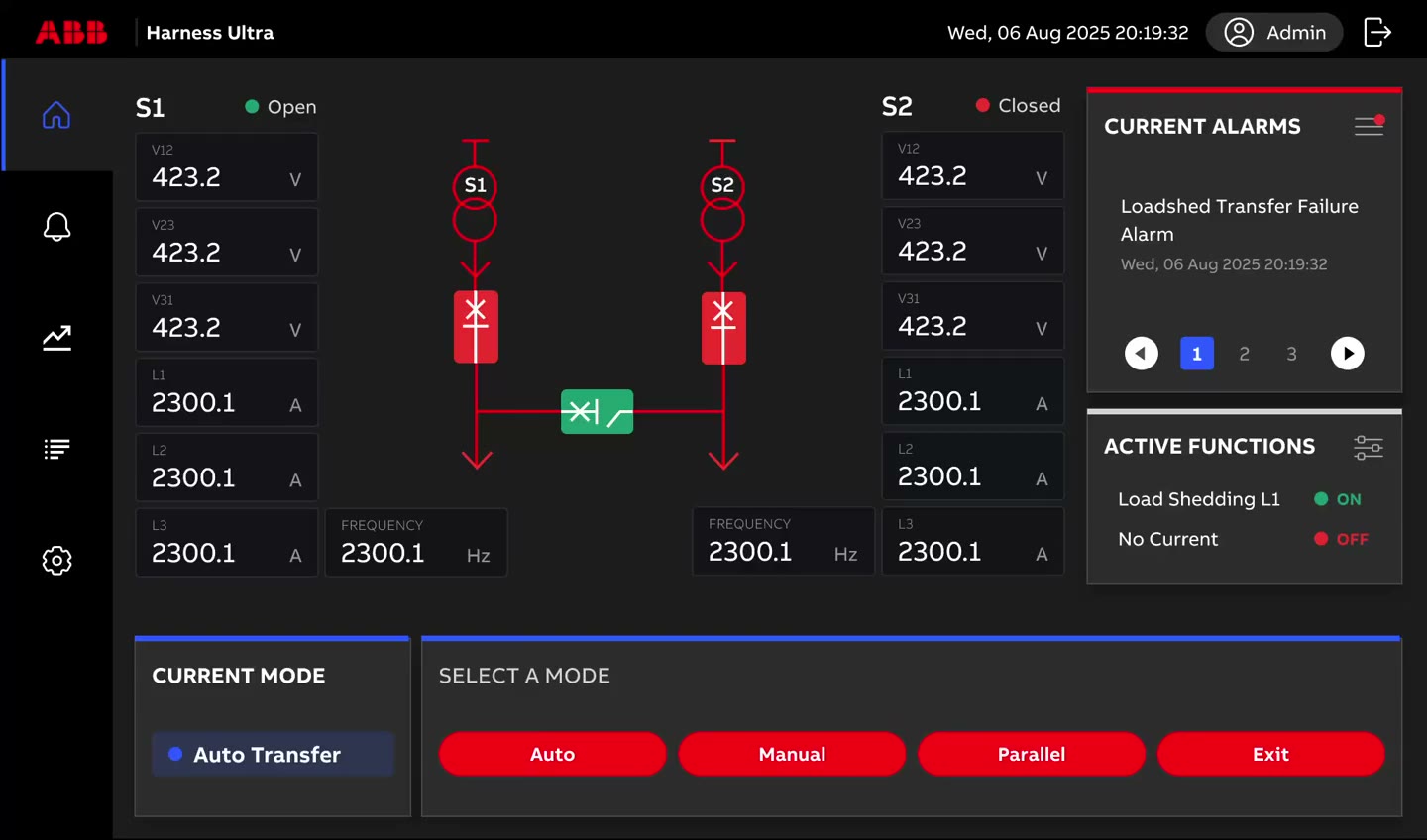
Harness Ultra dashboard shown on a 7-inch industrial touchscreen, mounted on a switchgear cabinet in a power distribution room

Project type

  • B2B
  • Industrial Automation

Team

  • 1 Product Owner
  • 1 Product Manager
  • 9 Engineers
  • 1 Product Designer (me)

Role

Product Designer

Timeline

  • Jan - Jun 2026
  • (5 months)

OVERVIEW

Product

Harness Ultra is an industrial control system for operators who monitor and operate circuit breakers across power systems. It is a Human-Machine Interface (HMI) that runs on dedicated 7-inch touchscreen installed on-site at customer facilities such as factories, hospitals, and data centers.

What I Did

As the only designer on the team, I led the end-to-end HMI design across discovery and 0→1 design. I aligned the product framework and milestones with the product owner and product manager, conducted competitive research to ground requirements, and optimized the information architecture with the system architect. I applied ABB’s existing design system with product-specific adjustments. Throughout the process, I translated ambiguous business goals into executable design solutions.

Result

I delivered V1 with five core modules: Home, Alarm, Trend, Log, and Settings. The design was presented to senior leadership in ABB’s Power Division and approved. V1 became the foundation for the rest of the product roadmap in Wave 1.

FINAL WORK

Core Design Moment #1

Prioritizing critical control of circuit breaker mode switching

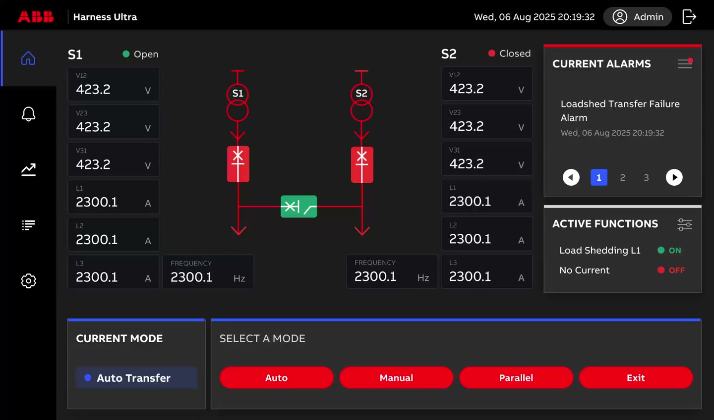
Demo of switching circuit breaker operating mode from the home screen: tapping Manual, Parallel, or Exit opens a confirmation dialog describing the consequences (e.g. disabling Load Shedding and No-volt Detection) before the mode actually changes.
I elevated the mode switching from secondary screen to home screen as a self-contained card, where users can control operating mode with fewer steps, contextual awareness, and instant feedback. From business perspective, this also strengthened Harness Ultra’s differentiating feature and market positioning.

My Design Process

Problem

Top-priority action buried in secondary level

After discussions with the PM, conversations with lead users, and a competitive analysis, we discovered that the problem with the current low-fidelity flow is that the high-priority and differentiating capability of mode switching wasn’t visible from both operating experience and business perspectives.

What I Did

Weighing four ways to surface mode switching

I compared four approaches against what mattered most in this context: how quickly and safely an operator could act, whether breaker readings stayed visible, and what each option would cost in screen space and implementation.
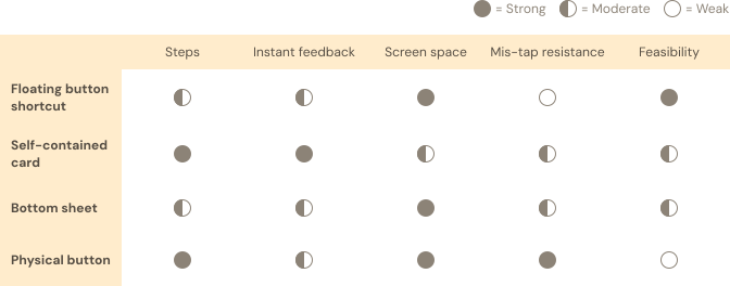
Table comparing four ways to surface mode switching — floating button shortcut, self-contained card, bottom sheet, and physical button — against five criteria: steps, instant feedback, screen space, mis-tap resistance, and feasibility. Each cell is rated strong, moderate, or weak.

I decided to go with self-contained card on the home screen since it allows users to instantly access and get feedback with relatively safe operation and high feasibility.

Core Design Moment #2

Preserving situational awareness within the drill-down structure
Demo of navigating the Settings drill-down: the breadcrumb and primary/secondary/tertiary menus stay visible while moving from Parameters > Voltage to Parameters > Frequency to Load Shed > Current Load Shed.
I kept primary, secondary, and tertiary navigation persistently visible, with the breadcrumb answering “where am I” and the menus answering “where can I go.” This allows users to stay aware of their current location and context.

My Design Process

Problem

Many configuration and control workflows exist within deep navigation hierarchies.

Like most industrial systems, Harness Ultra organizes its functionality as a drill-down tree. Such structure has good scalability, but users find it hard to track where they are. The main goal is to make users intuitively understand their position within this limited panel.

What I Did

Spending screen space to keep context clear
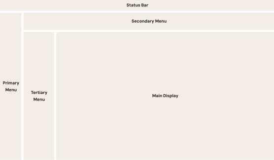
Diagram of the 7-inch panel's layout zones: a status bar across the top, a secondary menu bar beneath it, a primary menu rail on the left edge, a tertiary menu rail beside it, and the main display filling the remaining central area.

Core Design Moment #3

Preventing mis-operations while lowering visual noise
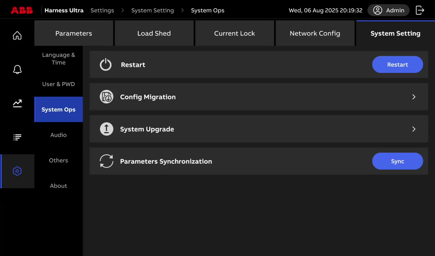
Demo of exporting the HMI configuration from System Ops > Config Migration: tapping Export shows an 'Exporting configuration. Please wait.' progress state before returning to the settings panel.
I designed the feedback system (i.e. report, confirmation, authorization, etc.) for high-stakes actions based on their risk level. These work as gatekeepers for execution of high-risk operation.

My Design Process

Problem

Key actions have different reversibility and consequence

Modules of mode and settings contain a range of key actions. Some only need to report what the system is doing. Some need the operator to acknowledge that they've seen a state. Some need the operator to commit to an action before it executes.

What I Did

Mapping out 3 tiers of feedback
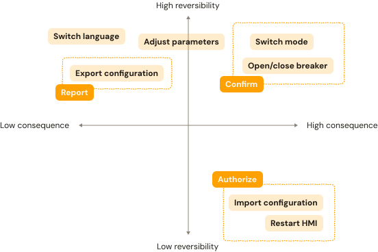
Quadrant map plotting key actions by reversibility (vertical axis) and consequence (horizontal axis), grouped into three feedback tiers: Report (switch language, adjust parameters, export configuration), Confirm (switch mode, open/close breaker), and Authorize (import configuration, restart HMI).

Report

Simple notification of what the system is doing.

Report dialog showing a loading spinner with the message 'Exporting configuration. Please wait.'

Confirm

Showing the outcomes & confirmation before execution.

Confirm dialog warning that switching to Manual mode disables Load Shedding and No-volt Detection features while in Auto mode, with Cancel and Confirm buttonsError dialog reading 'Export failed. Please try again.' with an OK buttonSuccess dialog reading 'Export successful' with an OK button

Authorize

Confirmation & password authorization.

Authorize dialog warning that restarting the HMI will interrupt operations in progress, prompting for a password before confirming, with Cancel and Confirm buttons

REFLECTION

I learned a lot

Diverge before committing, iterate after --

Easy answers are not wrong when moving fast, but try alternatives when there is time/resources. For niche product, widen the options and run them past users with domain-specific background to find out the best.

Think as a product owner

Proactively identify opportunities, such as usability testing, to improve the product experience, but don’t forget to stay grounded in priorities and constraints.