

Elevating scalability in intelligent power monitoring and analysis

Project type
- B2B
- Industrial Automation
Team
- 1 Product Owner
- 1 Product Manager
- 9 Engineers
- 1 Product Designer (me)
Role
Product Designer
Timeline
- July - Sept 2025 (UI Redesign)
- Jun 2026 - now (New Features)
OVERVIEW
Product
What I Did
Result
PHASE #1: REDESIGN
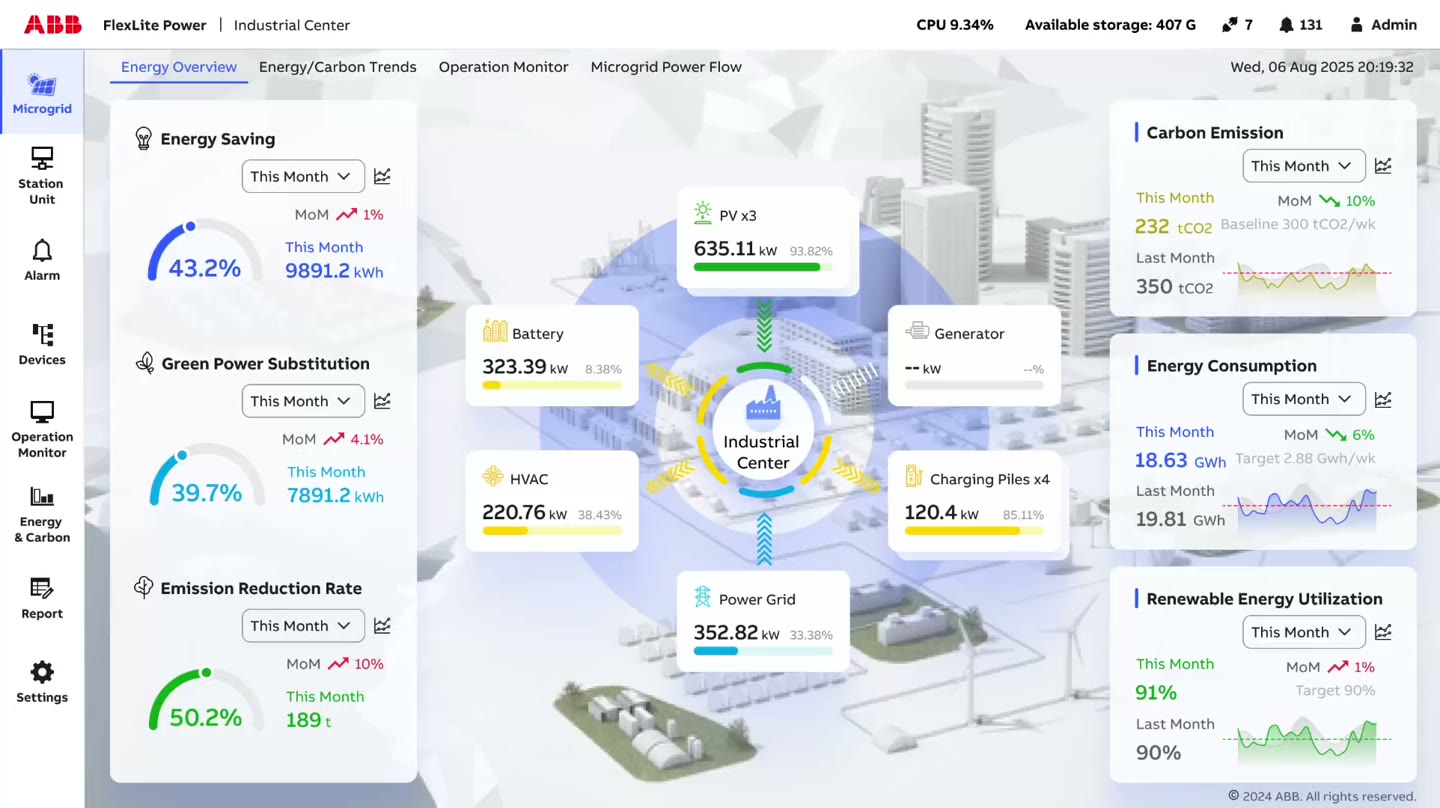
Strengthening the drill-down hierarchy and improving visual clarity
I unified the navigation, color language, and components across 11 modules.
Before
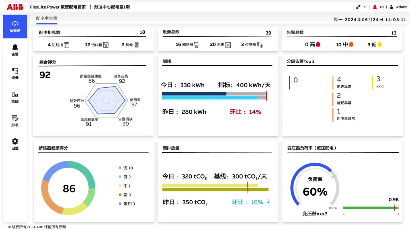
After
PHASE #2: SCALING TO A NEW LAYER
Operators need to monitor overall performance of multiple power distribution rooms at one station
Working with the PM and conducting a focus group of 4 on-site operators, I broke it down into 4 specific needs.
For operators

Easy understanding
Operators want to easily view and understand key metrics that aggregate multiple rooms’ performance.

Local focus
Their primary focus is still monitoring and controlling the local room where they are standing in.

Familiar patterns
They hope to stay consistent with the system they already knew
For our team

Low-cost to extend
Engineers on our team hope to keep it low-cost when building for a new requirement upon the current structure.
Evaluating 3 design options
I came up with the following design ideas and evaluated them upon specific needs.
Option #1: Local/Station Toggle


Pros
- One click to view
- Keeps operators inside the interface they already know
- Easy to build
Cons
- Station and local are not the same level, so this layout is confusing
- Station overview feels secondary
Option #2: Start with Overview


Pros
- Station structure is clear
- One consistent entry point for the entire station
Cons
- Pulls attention away from local control
- One extra step to reach the local room
Option #3: Dedicated Microgrid Tab

Pros
- One click to view
- Gives the station overview its own layer without changing local control
- Stay consistent with the navigation and drill-down patterns
- Builds on the existing code structure with low engineering cost
Cons
- One extra step to reach the local room
Option 3 surfaces the station-wide overview without competing with operators’ focus on their local room, and it extends the system by building on the existing hierarchy rather than restructuring it. I offset that extra step by making the current station unit the landing screen.
REFLECTION
This is my first time working as an independent designer on a complex enterprise-level product
Systems thinking
Think beyond individual module screens. Consider how modules are connected, how information flows across the entire system, and how things should be organized to better match users’ mental model.
Speak the right language to different stakeholders
Internal (e.g. PM, engineers, and sales) and External (e.g. users) stakeholders have different priorities. Use tailored ways of communication and terms to smooth collaboration.